| Entrance | Mainstreet | Wiki | Register |
|
# of watchers: 13
| D20: 8 |
| Wiki-page rating |  Stumble! Stumble! |
| Informative: | 0 |
| Artistic: | 0 |
| Funny-rating: | 0 |
| Friendly: | 0 |


2010-04-06 [Aeolynn]: Just have it fold down, next to her knees, so that its mostly covered by hair~ XD
2010-04-06 [Chel.]: Yea, that's sort of how I've been placing it... :P
2010-04-06 [NOOOPE]: Well, her other shoulder is more forwards... so it'd come to a peak behind and above her head and then settle near her ankles, I'd think...
2010-04-06 [Chel.]: NEW PIC!
2010-04-06 [Teufelsweib]: ha ^^ I'm too bad to see the difference between the two kinds of paint, but especially the pencil looks great! I still can't believe this is digital xD
2010-04-06 [NOOOPE]: Awesome. Though watercolor/oil dun really look like that too much, this pic is still awesome so screw any nit picking.
2010-04-06 [Chel.]: Dude...it was difficult. >_>' Pencil was the easiest...
2010-04-06 [Daisy_Sandybanks]: I like them! Very well done. Making digital media look like tradition media is extremely hard, but you did a fantastic job on these!
I especially love the charcoal one, I love the little details that you added to it to make it look like charcoal (the smudges and whatnot).
2010-04-06 [Chel.]: Thanks hun!
2010-04-07 [Aeolynn]: I think they all look convincing enough to appear as the modeled mediums :]
2010-04-07 [Chel.]: The charcoal turned out looking more like an ink wash..
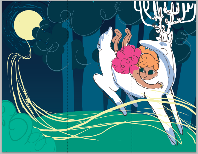
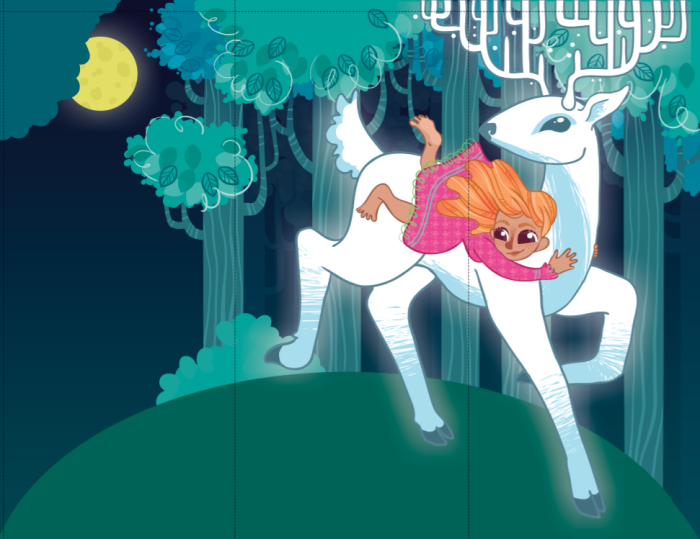
2010-04-18 [Chel.]: NEW.
2010-04-19 [NOOOPE]: Oooo, I like! I like the day and night ones the best. The evening one isn't as convincing to me, but I can't figure why...
2010-04-19 [Chel.]: Yea...that one is weird to me too. I think the purple throws me off. It should be more... red and orange.
2010-04-19 [Keylla]: Amazing work with the colors! My favorite is Dusk ;D (and I dont see anything wrong with the purple in it, it works)
2010-04-19 [Aeolynn]: I like the night one the most, just has a nice aura to it :]
2010-04-20 [Daisy_Sandybanks]: The day one has to be my least favorite, oddly enough. That may be due to the fact that I love darker tones though.
Overall, very well done! :)
2010-04-20 [Chel.]: I like the night one too, it's probably going to be the one i pick for my final
...i think the day one is really clishe.
2010-04-22 [Chel.]: new image, yo.
2010-04-22 [Chel.]: For me, it was between the top right and bottom left.... went with bottom left.
2010-04-22 [NOOOPE]: AH! I just wrote you this big comment about how they look too much like flappers, not noticing that was the point... I feel stupid.
And I like the last one, but, uh, too late.
| Show these comments on your site |
|
Elftown - Wiki, forums, community and friendship.
|